I'm avoiding the long-winded type article and getting to the good stuff. Here are a couple of links to blogs where I got my start.
http://thecolorist.blogspot.com/2007/03/making-pastels-continued.html
http://www.danielsmith.com/content--id-67
Instead of Gum Tragacanth as the binder, a 2 to 1 mixture of calcium carbonate and french talc is used (which I'll refer to as "the binder"). The trick is to find out how much binder to use with the pigments. It has virtually no effect on the color you are mixing but a lot on how soft or hard your sticks are and different pigments may need differing amounts. Measurements in teaspoons are close, I used a little plastic cup from Robutussin. When I say 2 to 1 or 1 to 2, etc. I mean pigment to binder.
The first tests of 4 to 1 made the sticks very crumbly, and even 2 to 1 were crumbly. tested on museum separation paper ( a very lightweight paper with a nice smooth texture ) and then BFK Rives, which makes pastels really stick to it.
After some mixes the best results so far are 1 part pigment to 1 part binder.

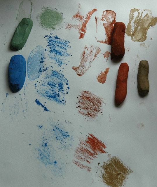
Top: 2 tsp of Burnt Sienna + 2 tsp Red Ochre + 4 tsp binder.
I would make a stick from 1/3 or 1/2 and add another pigment to the remainder to change it ( plus the same amount of binder ). One tsp of Dark Yellow Ochre or Titanium White. For the last piece a batch of white was made with extra binder 1 to 2 (read that somewhere, more binder for Titanium White). Then a small piece of the extra color was added.
Second row are 1 pigment color and binder. Note the Natural Umber is very hard.
Maybe a little crumbly on the museum paper but the BFK Rives ate them up! But you know how that paper is. I know, no test on Canson Mi-tientes... yet.
A pic of the crumblies. Good thing I can recrush these and add more binder. Can't do that with oils!
 |
| The crumblies. |
2 tsp Lemon Yellow + 2tsp Lavendar Blue. Very yellow-green. Then a little Burnt Umber added.


In my quest for some dark greens here some tests.
 |
| 2 Pistacio Green + 2 tsp Natural Umber + 1/2 Natural Black, like this. |
 |
| NO GREEN PIGMENT: Dark Yellow Ochre and Lavendar Blue, equal amounts. A dark warm muddy green, just what I always wanted. Added some Natural Black to this and made it darker. |
Set 2 of Pastels
I'm realizing I'm doing a bad job of keeping track of all the pastels I'm making. I take some notes while mixing but put the pastels here and there to dry and not sure what is what since I'm playing around with color a bit while mixing. Some are green with Burnt Umber, Green with natural Umber and Lemon Yellow + Lavender Blue + pinch Red Ochre and then lightened with white, I think.
All of these turned out very usable with the darker ones where black was added are kind of soft with a little grainy feel, where the lighter ones are very soft and velvety.

I can say this: 2 Dark Yellow Ochre + 2 Lavender Blue will give a dark muddy green. I halved it and then added some black. The yellow and blue make a lighter yellowy green and even the Pistachio Green with the set isn't a great green to make rich landscape colors. I'll have to get SOF Green or Viridian at some point.
The dull pale Orange top row is 1 Red Ochre and 2 Lemon Yellow, very very soft.
 |
| Pis. Green (left) vs. Lemon Yellow + Lavender Blue mix wet |