Tuesday, March 9, 2010

Lit Artists


Here's a pic from the Friday I missed. The model is the girl at the far left. My drawing of her is a few posts below.

Misc Notes

Some thoughts on pastels I've used: I really like the Unisons and will be using those with my pastel pencils Faber-Castell Pitt and Conte which are a little softer. The Unisons are soft and creamy.

I first bought some basic Rembrandts - they are hard but I liked the texture look on paper. Almost wish I had a portrait set to try out.

Sennelier are very soft but with a crumbly, grainy feel and make a lot of loose particles.

I see how difficult it is to photograph the pastels. Its hard to pick up all the delicate color and you lose the pastel texture look. I think I need to throw more natural light on the paper.

Pastel Portrait of Kristen


Since I missed last Friday's model session I had Tim take a few photos of our model. It took quite a while for the initial drawing since I start with a nice charcoal drawing and like to see all the details at this stage, and then take away the shading before starting with pastel. The likeness was good but not quite right. I kept at it for quite a while, over a few days, fixed the chin, added more hair, and worked on the jaw and it came out great.

Pastel Portrait of Larry


This is the first portrait using the Unisons. Larry is a fellow portrait artist who creates unique color portraits using Prismacolors. I snatched a small blurry photo off of his Facebook page for the reference.

New Unison Pastels

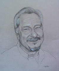
I finally got around to trying some Unison pastels for a portrait. I had bought the Caucasian Portrait set of 8 colors and tried them out on a practice drawing. I really liked the way you can lay down color with these. They are very soft and creamy feeling, not crumbly like the Sennelier I have.

Although I had just a few colors to work with I knew these were the ones to get. I found a great deal on Ebay for the 36 color portrait set and was very happy to get the deal.

The set is a very nice range of colors, light to medium, cool and warm reds, and a good range in the light colors red, green, yellow and blue. Of course there are some darks for shadows and hair in the same colors. The darks are not quite as soft and can be a little grainy if you're using a light touch.

But what impresses me the most is I can can keep laying down light to medium colors right on top of each other and not worry too much of filling up the tooth of the paper. I use my finger to blend the colors and read a great tip of using tissue paper to smooth it out. The tissue also is great at picking up extra color you don't want.

There's still a lot of color experimenting to do, laying down different colors for different tones. I've also used my pastel pencils for detailed areas and also to add some color that are not in the Unison set. I'll also use a charcoal pencil for some small dark areas.